
Under Design › Logos you set the logo, the app icon and the launch screen of your app as well as the logo of your In-Store app. Each section shows a preview on the right. Selected images are only uploaded when you click Save in that section.
App Logo
The logo appears at the top of your app, in the header.
| Requirement | Description |
| Format | PNG or SVG, 356 × 78 px, transparent background recommended |
| Other aspect ratios | Are cropped to 356 × 78 px from the center. |
App Icon
iOS: PNG, 1024 × 1024 px, square, no transparency. iOS rounds the corners itself, so use an image without rounded corners.
Android: Under Icon mode you choose between Adaptive and Legacy.
Recommended: adaptive icons
With adaptive icons, your icon fills the whole icon shape on every Android device, whether round, rounded or square. From Android 13 the system can also tint your icon as a themed icon to match the device wallpaper. In Legacy mode, Android shrinks the icon instead and places it on a white tile.
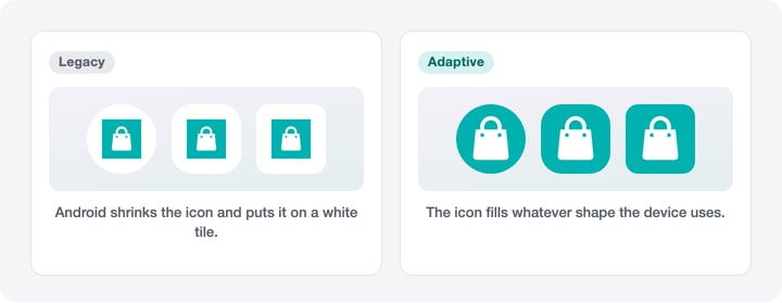
| Icon mode | Description |
| Adaptive (recommended) | Separate foreground and background layers, from Android 8. Optionally a monochrome icon for themed icons from Android 13. |
| Legacy | A single icon: PNG, 512 × 512 px, square. Android shrinks it and places it on a white tile, round or rounded depending on the device. |
In Adaptive mode you add the following layers:
| Layer | Description |
| Foreground | PNG, 512 × 512 px, square, transparent background. The logo is centered on 60 % of the icon area. A compact mark works best; a wide wordmark ends up very small. |
| Background | A color (#RRGGBB) or an image (PNG, 512 × 512 px, square, no transparency). The background fills the whole icon area. The edges are cropped depending on the icon shape. |
| Monochrome (optional) | PNG, 512 × 512 px, square, transparent background. For themed icons from Android 13: the system only uses the shape and tints it to match the device wallpaper. Ideally use the same mark as the foreground, as a one-color silhouette. Cut out text and details as transparent, otherwise they will not show. |
With Safe zone you show the circle in which the logo is never cut off, whatever the icon shape.
For step-by-step instructions with diagrams, see Android app icon: setting up adaptive icons.
App Launch Screen
The launch screen appears when the app starts. Under Background you choose Color or Image:
| Background | Description |
| Color | Background color as a HEX code (#RRGGBB) |
| Image | PNG, up to 2048 × 2048 px, no transparency. The image fills the whole screen. Anything beyond the screen is cropped from the center. |
On top you can place up to two images (Logo 1, Logo 2; PNG, up to 2048 × 2048 px):
| Field | Description |
| Alignment | Center, Top or Bottom |
| Top % / Bottom % / Left % / Right % | Distance to the screen edge in percent of the screen height or width. The image is fitted into the free area. |
Under Device you switch the device of the preview.
In-Store App Logo
The logo of your In-Store app: PNG or JPG, 256 × 256 px, square.
What happens next?
Changes on this page only appear with the next version of your app. Please let our App Management team know at support@shopgate.com.