
This feature is currently being rolled out in stages. If you cannot see this area in your Shopgate backend yet, or if you have any questions, please get in touch with your Shopgate contact.
Requirement: your app theme must be at version 7.32.0 or higher. Earlier versions do not support the settings described here.
Overview
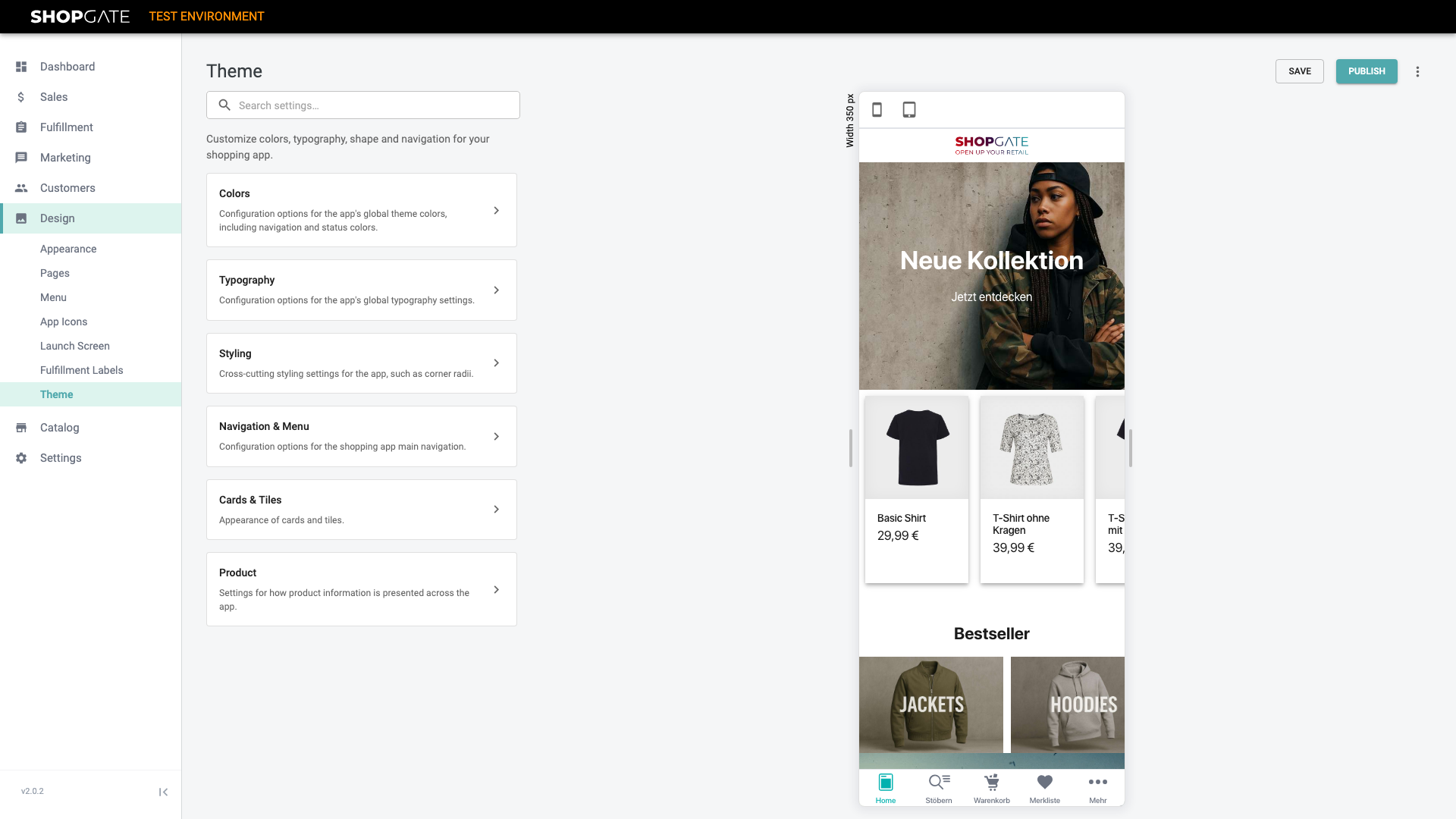
In the Shopgate backend, open Design → Theme.
The page has two halves: the settings on the left, grouped into six categories, and a live preview of your shopping app on the right, where every change is rendered immediately.
Use the icons above the preview to switch between phone and tablet views.
| Category | Contents |
|---|---|
| Colours | Brand, text, navigation and status colours of the app |
| Typography | Global font settings |
| Styling | Corner style and spacing for media widgets |
| Navigation & menu | Appearance and behaviour of the main navigation |
| Cards & tiles | Appearance of cards and product tiles |
| Product | How product information is displayed |
Finding settings quickly
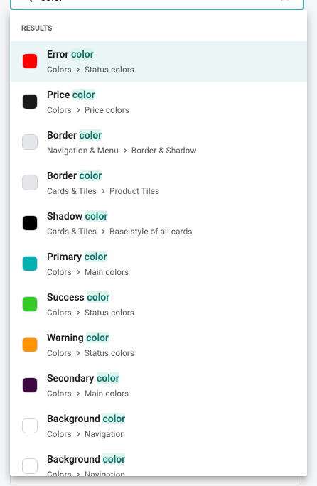
If you are unsure which category a setting belongs to, use the search settings field above the categories.
The result list shows the full location for each setting, for example *Colours › Main colours*. Clicking a result opens that setting directly.
Light and dark appearance
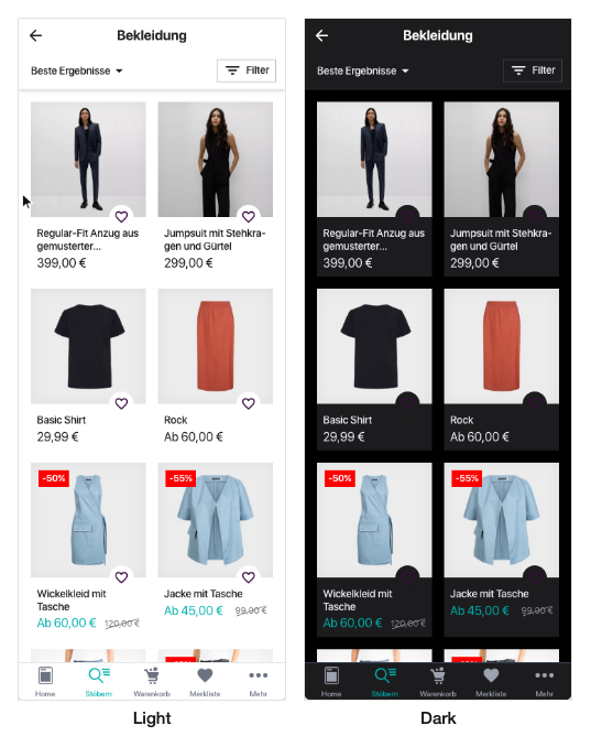
In the Colours category, *Theme → Appearance* defines whether your app is displayed in light or dark mode.
The setting affects the entire app. The preview applies the change immediately, so you can check contrast and readability right away.
Defining colours
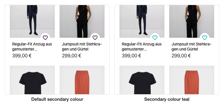
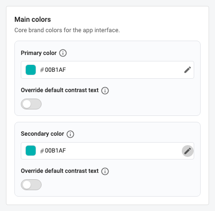
Under Main colours you define your app's brand colours. The *primary colour* shapes key interface elements such as buttons, the *secondary colour* serves as an accent.
Click the pencil icon to open the colour picker, or enter the hexadecimal value directly. The *override default contrast text* option determines which text colour is used on top of that colour.
Further down the category you will find additional colour groups.
| Group | Description |
|---|---|
| Text colours | Body text and secondary text |
| Navigation | Colours of the top and bottom bars |
| Surface colours | Page background and content surface backgrounds |
| Price colours | Regular price, sale price and struck-through price |
| Status colours | Error, warning and success states |
Typography and custom fonts
In the Typography category you define the font settings for the entire app: base text size, base line height and the three font weights *Regular*, *Medium* and *Bold*.
Below that you will find separate sections for buttons and prices, where font size, line height, font weight and text transform can be set independently.
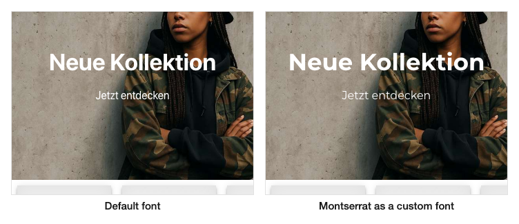
Using a custom font: switch on *Load a custom font*. Then enter the address of the stylesheet that provides your font under *Font URL*, and the name of the font family under *Primary font family* – exactly as it is defined in the font.
An example of such a URL: https://fonts.googleapis.com/css2?family=Playfair+Display&display=swap with the font family Playfair Display. Use the address of your own licensed font here.
Navigation and menu
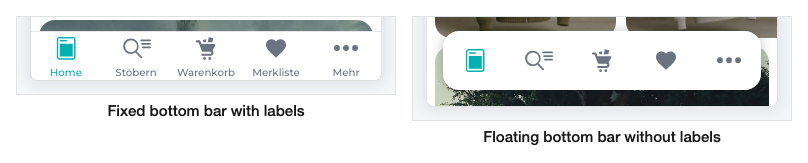
In the Navigation & menu category, *Main navigation* determines how the bottom navigation bar looks and behaves.
For the floating bottom bar you can additionally adjust its shadow under *Border & shadow*: horizontal and vertical offset, blur and spread radius, and the shadow colour.
| Setting | Description |
|---|---|
| Navigation style | Floating or fixed bottom bar |
| Show labels | Shows or hides the captions below the icons |
| Hide while scrolling | Hides the navigation bar while customers scroll |
| Transition effect | Animation used when showing and hiding the bar |
| Show favourites counter | Shows the number of favourites on the icon |
Corner style
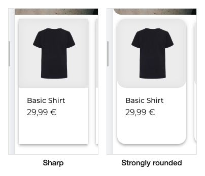
In the Styling category, *Corner style* defines how strongly corners are rounded in your app. The setting applies uniformly to product and category images, cards and buttons.
The options are slightly rounded, medium rounded, heavily rounded, square and custom. With the custom option you specify the radius in pixels yourself.
Spacing for media widgets
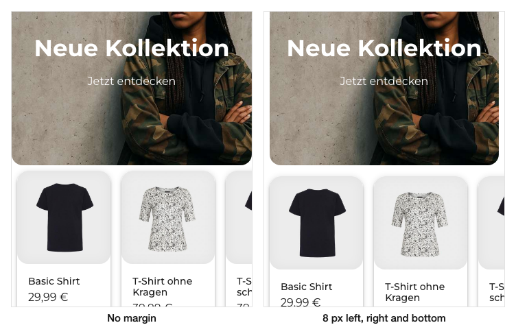
Also in the Styling category, *Spacing for media widgets* sets the default spacing around image and video widgets. You can specify separate values for top, bottom, left and right in pixels.
This spacing applies exclusively to image and video widgets. Other content such as product lists or category lists remains unchanged. To see the effect in the preview, scroll to a position where an image widget is displayed.
Individual widgets can override this default. A widget with its own spacing setting is unaffected by changes made here.
Cards and tiles
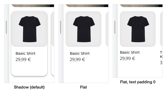
In the Cards & tiles category, *Base style for all cards* defines how cards are displayed in your app. Cards are raised containers that group related content, such as line items in the cart or products in a slider.
| Card style | Appearance |
|---|---|
| Shadow (elevated) | Cards are raised from the background with a shadow; strength and colour are configurable |
| Border (outlined) | Cards get an outline; border thickness and colour are configurable |
| Flat (no border) | Cards are displayed without shadow and without border |
Product presentation
The Product category controls how products are presented in your app.
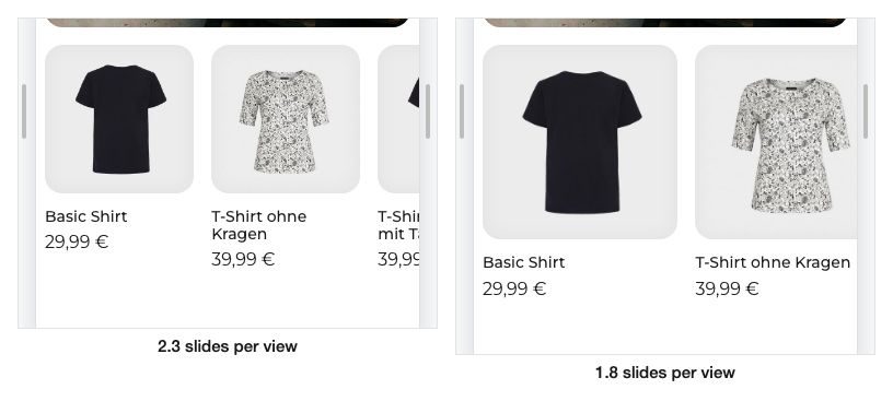
In the product grid you define how many products appear side by side – separately for small and large screen widths. For the product slider you instead define how many products are visible at once; decimal values such as 2.3 make the next product appear partially cut off, inviting customers to swipe.
Under product images you set the aspect ratio of your product images. Enter width and height as a ratio: 1 to 1 produces square images, 3 to 4 portrait ones. You also define the fill colour shown behind images that do not fill the frame, plus an optional inner shadow.
| Setting | Description |
|---|---|
| Products per row | Number of products side by side in the grid, per screen width |
| Slides per view | Number of products visible at once in the slider; decimals cut off the next product |
| Aspect ratio | Format of product images, for example 1:1 square or 3:4 portrait |
| Image fill color | Background colour behind images that do not fill the frame |
Transferring a theme configuration
The three-dot menu in the top right transfers a finished theme configuration from one shop to another. This is useful, for example, if you want to agree on a design in a test shop first and then adopt it in your live shop.
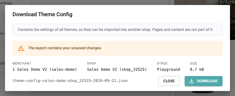
Download theme configuration creates a JSON file containing the settings of all themes. Before the download, a dialog shows where the configuration comes from.
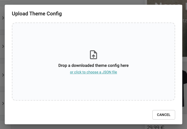
Upload theme configuration opens an area where you can drop the downloaded JSON file. Alternatively, click the area and select the file.
Important: the file contains theme settings only. Pages and content are not transferred.
| Field | Meaning |
|---|---|
| Merchant | Merchant account the configuration comes from |
| Shop | Shop the configuration comes from |
| Stage | Environment, for example playground or live |
| Size | File size of the JSON file |
Saving and publishing
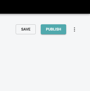
In the top right you will find the two buttons that complete your work:
Save stores your changes as a draft. Nothing changes in your customers app at this point, and you can continue editing later at any time.
Publish applies the settings to your shopping app. Only this step affects your customers app.
Do you have questions about individual settings, or are you missing an option? Your Shopgate contacts are happy to help.